I can deal with design that is not up to Doejo standards and, in fact, sometimes “bad” is actually charming and good or really simple and useful (see RJ Grunts).
Yet, Grubhub makes me work too hard.
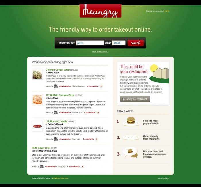
Do not make me enter my full address when my zip code should suffice. I understand I can make an account and save all that info, but why? Just let me jump on and order. It’s been a frustrating experience for me, not being able to get info quickly and efficiently from a platform that says you can get info from their platform quickly and efficiently.
So yesterday I was hungry and came across the Grubhub iPhone app and thought, alright! They must have made the user experience great on this app because apps force you to make things faster and easier. So, I downloaded app, starting with my address and the type of food I was after, found a place I was super excited to order from, went to add an item to my order . . . and then got stuck. Stuck because I was forced to login but the app was not allowing me to scroll down in order to do so. I was forced into a no man’s land while I was really crabby and super hungry. Not a good user experience.
We at Doejo think eating is important and online ordering should be easy for the restaurateur and the hungry consumer. So, we are proud to announce the development of Meungry, a site designed to make online food ordering and delivery easy and fun, social and productive.