
Steve Shanabruch is the man behind The Chicago Neighborhoods project, an adventure in graphic design that melds his passion for design and his love for the city of Chicago’s diverse collection of neighborhoods.
By day, Steve is the Art Director at Titan, the advertising vendor that places ads on the CTA and Pace transit systems. He spends his nights, however, working on The Chicago Neighborhoods project, where he is developing a logo that captures the distinct character of each individual neighborhood, using a mix of personal experience, online research and conversations with current and past residents.
Thanks to features in the RedEye, Chicagoist, Curbed Chicago and NBC Chicago’s Inc.Well Small Business blog, Steve has been able to expand his project’s business to include t-shirts, wall art and a large following on social media networks.
Below we catch up with Steve to find out the inspiration behind the project, his feelings about the mixed-media design trend and the other Chicago-centric projects that are occupying his free time.
Where did your inspiration for this project come from?
I started a personal project because I needed a creative outlet. I design stuff at work all day, but I never really get to design what I want to design. I needed to come up with a way to create things purely for the fact that I wanted to create them. After designing posters based on trips that my wife and I had taken together I became inspired by the Branding 10,000 Lakes project. I wanted to start something that would allow me to learn more about this great city and something that would allow me to continue my growth as a designer. I finally settled on creating typographic logos for all the neighborhoods in the city.
How do you capture the distinct personality and character of each neighborhood?
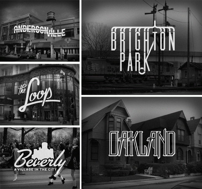
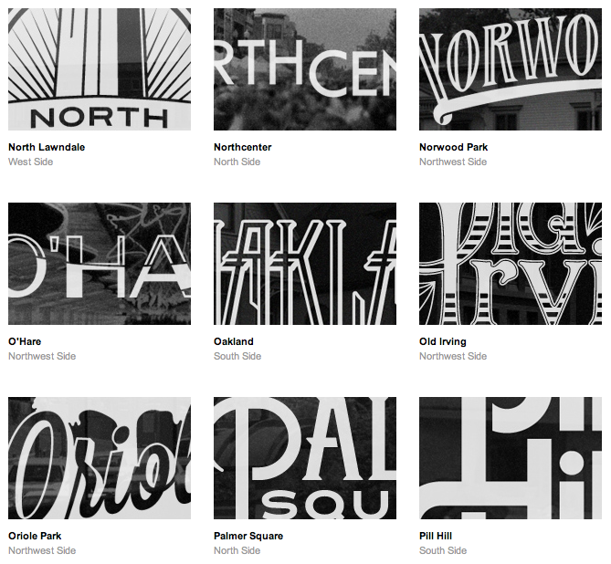
Most neighborhoods have a distinct personality or something about them that everyone knows–the Puerto Rican culture in Humboldt Park, baseball and beer in Wrigleyville, all things Swedish in Andersonville–but then there are some that are just kind of all over the place.
Take Lincoln Park or Lake View or Wicker Park: each of those neighborhoods is easily stereotyped, but do I want to base a logo on a stereotype? There is so much more to those places than that.
As the project got more of a following on Facebook and Twitter, people started to write in and tell me about their neighborhoods. The info coming directly from residents is so invaluable in a project like this. I’d truly like the designs to represent each area as best as possible and getting inside info from them is one of the best ways I can accomplish that.
Describe your design process. How do you begin to craft the logo for each neighborhood?
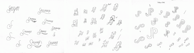
It all depends on the neighborhood and whether or not I have a solid idea in mind before I start. 75% of the time I jump right into Illustrator. When I really have no idea of where to start I start out with sketches. I also will sketch when I want an obvious hand-drawn look to the design. For example, I knew exactly what I wanted the Little Village design to look like: I wanted it to match the hand-drawn or hand-painted signs you see on the buildings and in the store windows in that neighborhood, so I sketched that one out.
How do you feel about the recent abundant use of mixed media design that combines photography and typography, like you do?
I’m a fan. If it is done correctly, I think it makes most designs more interesting. In the case of my work, I think these neighborhood logos I create work well on their own, but the addition of the background image makes them even more impactful.
The background image also allows me to incorporate something that drives home the overall reasoning behind the final logo concept. Whether it is some landmark in the neighborhood or a place that has some sort of personal meaning to me, I select images that I think are a good compliment to the logo design.
We love the design you created for the RedEye newsstand. What was your inspiration behind that?
The theme was #chicagoinabox, so I wanted to create something that I thought would represent the entire city, not necessarily RedEye’s target demographic. As you can probably guess, the neighborhood project totally influenced the design. The project has made me so aware of all areas of Chicago, from the far corners of the northwest side all the way down to the southeast side and everywhere between, so I wanted to find a way to incorporate the whole city into the design.
I ended up using colors closely associated with the city, two versions of a city map that I created specifically for the newsstand, a bunch of iconic things that Chicago is known for, and the names of just about all of the neighborhoods in the city.
You are very interactive with fans on Twitter – Do you have any tips for designers on how to use social media to grow their brand?
Be positive, be on subject and don’t overshare. People follow you or find out about you because they are interested in what you’re doing, not what you ate for lunch or your political thoughts. Keep that to your friends.
Social media has definitely influenced my design work and my career. I mainly follow designers whose work I admire on Twitter, and through following them, I continuously find more and more designers that are putting out amazing work. I see the level of work that is being produced and it pushes me to improve my own designs and pushes me to try new things that I normally wouldn’t try in my own work.
Tell us a little about your background in design.
I am a self-taught designer. It all started in 2005 with a bootleg copy of Photoshop 7.0 that my college roommate put on my computer. Soon after that, I found my first job. That was in 2007, and since then I’ve been fortunate enough to be employed at various full-time design positions in Oregon and Chicago. But the design doesn’t stop there! I spend my nights working on the neighborhood logos, freelance projects and other personal design projects … either that, or I’m working on my newfound hobby: stained glass. I recently took a six-week class at a studio in Ravenswood.
What’s next for you?
Well, I’ve still got a ton of neighborhood logos to design. I still need to go out and photograph the neighborhoods as well. I don’t know what I’ll do with myself after this project is all said and done. Since I had such a good time working on the Redeye box and working with stained glass, maybe I’ll step away from the computer a bit…? No, doubt it.