
 First impressions are important for any business. How do you want to be remembered? What emotional connection are you trying to evoke?
As a creative web agency, our designers are tasked with fashioning iconic looks—the crux of User Experience and engagement. A popular explanation of branding, identity and logo comes from design maven, JUST Creative.
What is brand? – The perceived emotional corporate image as a whole.
What is identity? – The visual aspects that form part of the overall brand.
What is a logo? – A logo identifies a business in its simplest form via the use of a mark or icon.
For example, let’s say Dutch artist Vincent van Gogh is a brand and his most beloved painting “The Starry Night”—and those seemingly glowing night stars—is his identity. This sleepy scene screams Van Gogh. The logo would be that iconic “Vincent” signature at the bottom right corner. It’s his identity in its starkest form.
As a representation of a company in it’s cleanest, most basic form, every little detail of a logo has to count. JUST Creative says the five principles of effective logo design are that it must be simple, memorable, timeless, versatile and appropriate. But how do you address these principles?
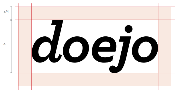
Here are some recent logos our design team has worked on. Read more about our growing Branding & Identity capabilities on Doejo.com.
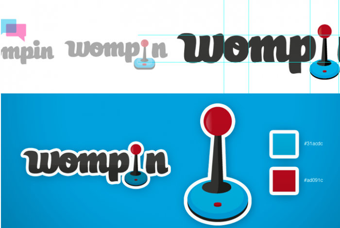
When the founders of Wompin came to Doejo to develop their brand identity, they wanted a logo mark that embodied their social-gaming app’s playful side. We tested out social imagery like conversation bubbles and retro video gamming tools like joysticks before coming up with Wompin’s quirky logo.
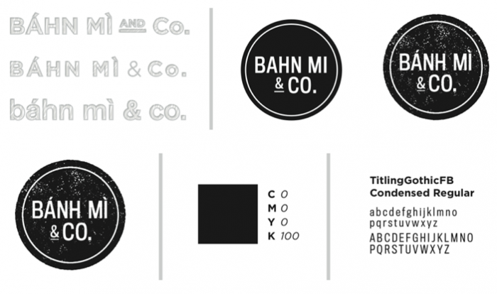
The owner of Vietnamese sandwich shop, Banh Mi was looking boost the look of his expanding Lakeview restaurant. He wanted a simple, clean, text heavy logo and branding identity, but with a vintage feel. So, we crafted a san serif font with a distorted texture. You can actually see the Banh Mi logo on their awning across the street from our office.
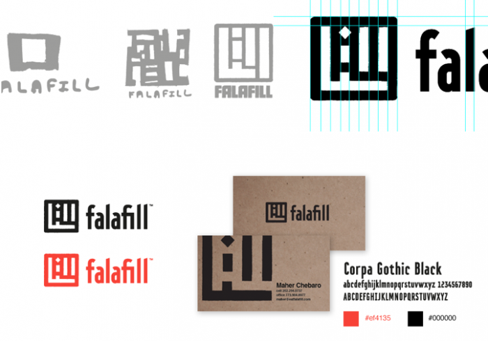
This vegetarian falafel restaurant is located in the heart of Chicago’s Lakeview neighborhood and describes itself as quick-serve street food. The founders taped Doejo to update their branding, as they expand, playing off Falafill’s “fill up” reference. Our team was inspired by Arabic Kufi calligraphy merged with an urban street map aesthetic.
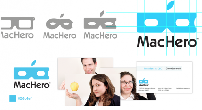
The MacHero technicians like to think of themselves as tech savvy caped crusaders when it comes to solving Apple product problems. But they felt their branding identity needed to be more robust and professional looking. Our team channeled their inner superheroes designing the perfect Apple-logo-infused mask to capture MacHero’s trustworthy, reliable, and faster-than-a-speeding-bullet charm.