
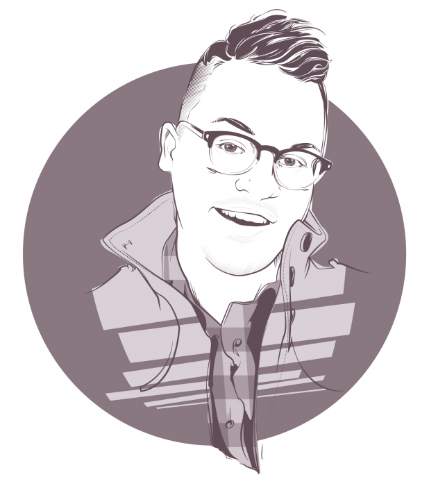
 Sometimes design and illustration work is a calling you can’t deny. For Chicago graphic designer, Kyle Letendre, it’s in his blood. But more on that below.
We chatted with Kyle about his letter type process, influences and upcoming creative projects.
Doejo: Tell us a little bit about the work you specialize in and your process.
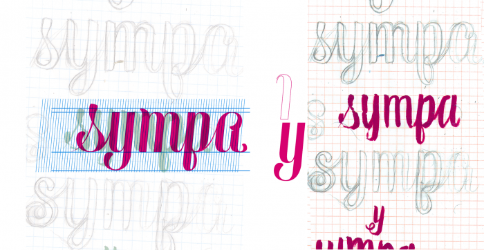
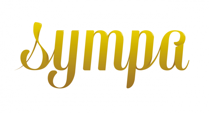
Kyle: By day I work as a designer, but my specialties are in type and illustration. With type, I always start by hand. Once I’m happy with how things are coming together, I’ll scan everything in. Sometimes I trace over my pencil sketches, but in other cases it feels best to just start fresh with some guides and a blank slate. After that, it’s just a lot of tedious changes, but tedious in an exciting way.
As for illustration, I’ve been working mostly digitally lately, with just the pen tool in Illustrator. I’m sure I could save myself a lot of time by investing in a tablet of some sort, but I also feel really good about the process and technique I’ve established. Sometimes it veers a little into Patrick Nagel nail-salon territory, but I think I’m okay with that.
What got you interested in typography?
I inherited a certain level of type obsession from my mom, specifically as it relates to handwriting. She got really poor grades in handwriting class when she was in Catholic Grade School, and was so embarrassed and ashamed that she worked relentlessly on her penmanship until she won the school handwriting contest the next year.
I think that level of obsession and drive is a little bit ridiculous, but completely admirable, and it’s a drive I share completely. So as soon as I learned that I could pursue type as a passion and hopefully one day, a full time gig, it’s what I wanted to do. I studied music in college for two years, but I kept going back to my dorm room to learn Photoshop and Illustrator, and I never regretted making the change to study design.
What similarities and differences to you see between illustration and typography?
Type and illustration feel very similar to me: they’re both very personal. I’m drawn to the versatility of being able to change styles and medium so freely, and both type and illustration feel like communication art to me. Because beyond just the letters or the portrait, there’s always something else to establish. There’s always a message or a feeling that gives a drawing or type treatment some intent or angle. What’s exciting about typography, and specifically typeface design, is to be able to hand off your end product and see it used in a variety of different contexts.
Do you have any tips for designers who want to get into type design or hand lettering?
It’s really easy to get ahead of yourself when it comes to type-things, and I’m totally guilty of it too. I think it’s important to really diversify and learn various crafts and to approach type methodically. If you’re working on something inspired by calligraphy, it can be tempting to do your research solely via Google images, but actually taking the time to learn the strokes and mechanics of calligraphy makes a huge difference when it comes to rendering the final piece digitally. The same goes for brush scripts, but maybe not for engraved type, just because that kind of terrifies me.
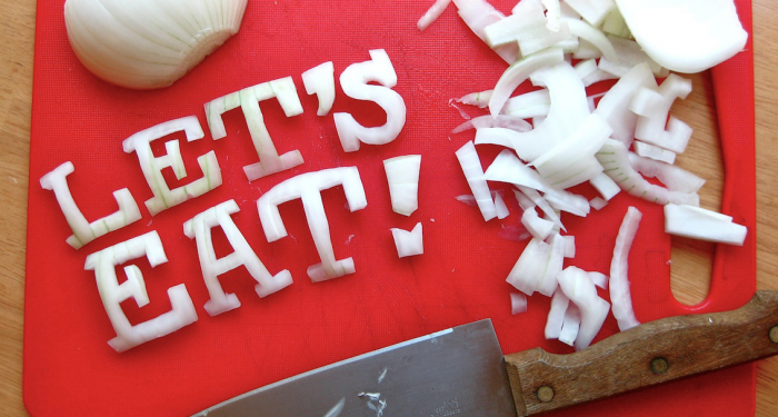
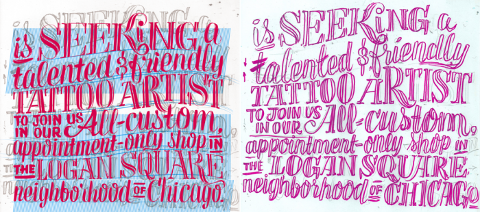
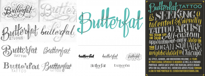
The “I Believe in Type” section of your website really stands out. Can you tell us how that got started and what kind of detail-oriented work went into making legible typography, especially when using only food?
I started “I Believe in Type” as a type sketchbook and an outlet for being able to practice lettering. The idea of creating type with no real purpose was really freeing to me, especially as a place to experiment with different styles and really learn Illustrator. The foods ones are definitely some of my favorites. I started doing them after seeing a lot of designers digitally recreate food textures. I kept thinking, “Why don’t you just make the damn thing in real life?” So I did. With the cheese and onions I just used an Exacto knife and took a picture with my crappy Point and Shoot. For the record: no cheese was wasted in the completion of this project.
I see on your site that you have previously sold a line of hand-sewn bow ties. What inspired that? How was it working with a physical product as opposed to a digital one?
Yeah! I started sewing my own bow ties in college, and when an assignment for a packaging class prompted us to develop a brand from the ground up, I turned to my ties. After graduating, I figured it was worth a shot selling them on Etsy. The response was really overwhelming, and I’m still really humbled by the positive reception. I think because I’m a bit of a decorative designer, textiles have always been a big influence for me, so working with bright patterns and trying to reinvent the same bow shape came naturally. The best part for me was being able to use some of my mom’s vintage fabrics. She regularly sewed new outfits for herself in high school, and it felt really cool to repurpose her scraps and send them around the world.
Do you have any other upcoming side projects we should know about?
I am a shameless big fan of Robyn. When she comes on at a bar (or in Target), I go from normal awkward wallflower to embarrassing-everyone-around-me in the span of three seconds. Last summer I organized a group of really talented designers and illustrators to do this big, illustrated love letter to Robyn, and I called it Body Talk: Illustrated. Each artist chose a different song from her Body Talk album, and they illustrated/designed/made an awesome kids activity page for each song. It’s taken a bit longer than I expected to get all the pieces, but I’m ecstatic about the quality of work that was submitted. Hopefully the book will be done this spring and available to buy! I’m also working on finishing a new font that I’m really excited about!
What is your ultimate goal as a designer?
The dream would be to be a part of a small studio where I could have my hands in every part of the design process, from a custom typeface to environmental branding, and even nerdy things like internal reports and paperwork. When you see really good top-to-bottom branding, it’s like a gift to the consumer and I would love to be a part of that. At some point I would also love to teach. A really knockout professor can have an incredible influence on a student’s career, and I would love to be able to inspire the same love for type that professors like Renee Ramsey-Passmore stirred in me. I also really want to study at Type@Cooper because obviously!
What is the best piece of design advice you have ever been given?
I had a gen-ed professor tell me, “You have to make the kind of work you want to be hired to do.” And maybe I’m just thick-skulled, but that thought had never occurred to me. It completely changed the way I look at design/type/making things.
I am the least athletic person in the world, so making a sports metaphor is kind of terrifying but: no one was ever drafted by the NBA because they wanted to play basketball. It’s because they pursued it relentlessly. Design is the same, except I get to do it at home watching Netflix with a tub of ice cream. (Is “drafted” even the right word?)
Who are a few designers whose work you admire?
Erik Marinovich is kind of the ultimate type designer for me right now. His attention to detail is mind-blowing and technically speaking he’s like some superhero-wizard-ninja, but what really drives it home for me is how playful and versatile his work is. He obviously takes his craft incredibly seriously, but he doesn’t seem to take himself too seriously, which is refreshing. And the fact that he shares a studio with the crazy-talented Jessica Hische is ridiculous. It’s inspiring that designers like Erik and Jessica are so adaptable with different brands and styles, but they maintain an underlying signature that makes their work recognizable in any setting.