
A wise man once said:
There are known knowns; there are things we know we know. We also know there are known unknowns; that is to say we know there are some things we do not know. But there are also unknown unknowns—the ones we don’t know we don’t know.
Here at Doejo, we believe that design can be a force for good in the world, but it requires acknowledging that the best design comes from the bottom up—that is by helping to fulfill the goals of the people for whom we make things. And that starts with not just knowledge of the problem, but the knowledge of how problems become known.
When branding agency Lindsay, Stone & Briggs approached Doejo to perform a UX review (or “heuristic evaluation“) of the store locator feature on the websites of Ariens snowblowers and Gravely lawn mowers, we made recommendations based on usability and aesthetics.
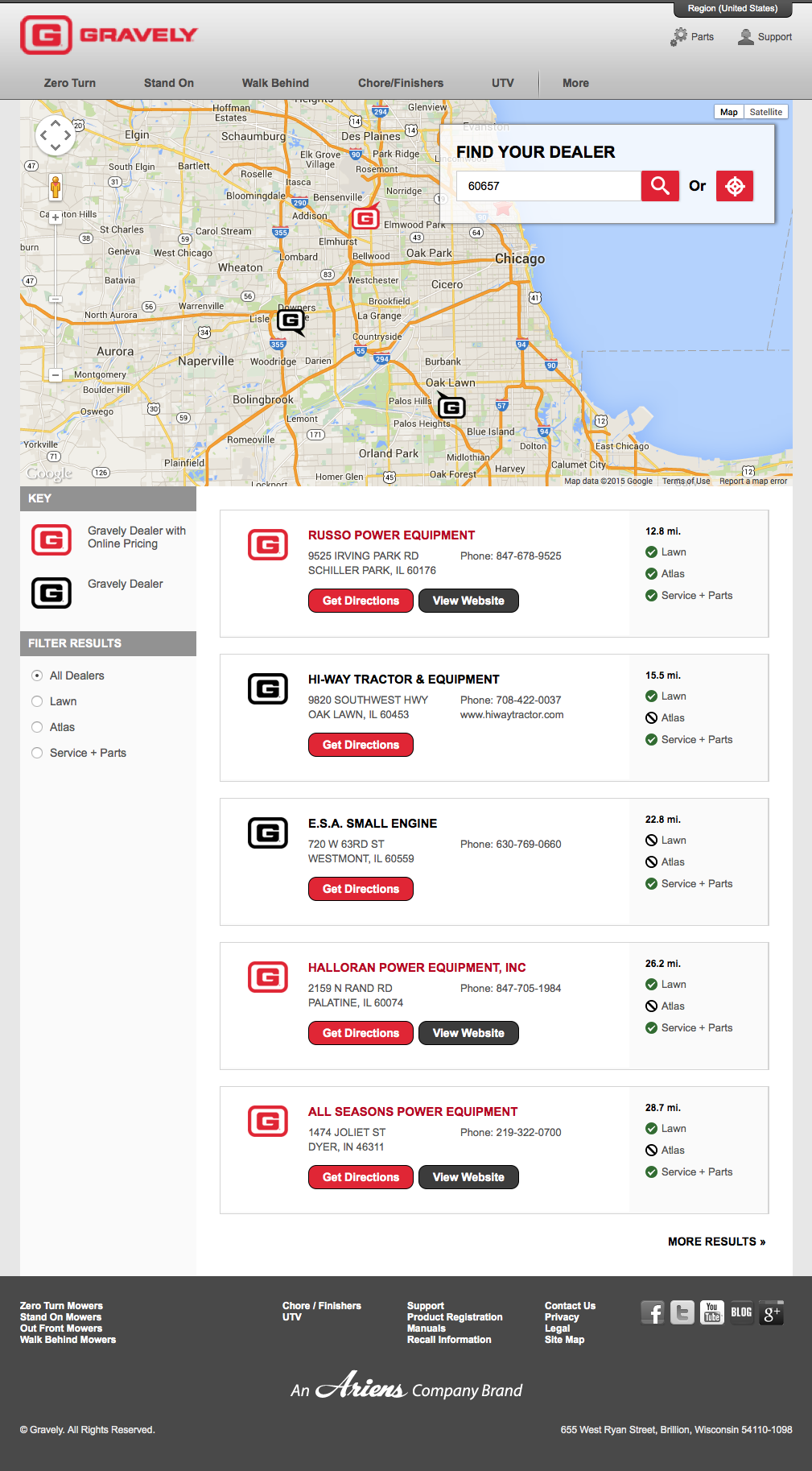
Some of the shortcomings included:
- Map does not display error message for a location with no results
- Depending on the location of a marker, the marker’s info window might pop up “under” the search input, obscuring the information
- Map zooms in and out on mousewheel/trackpad swipe when intent is to often scroll down the page
- The back button does not go to the previous page after performing a search
- Search facets (also known as “filters”) use radio buttons, which exclude the combination of more customized searches
And some of the more interesting concepts:
- Bearing in mind that the number of dealers is not overwhelming, consider showing a national or worldview of all locations
- Consider a two-column view of location-map that websites like Foursquare, Pinterest, and Yelp have adopted, that also allow location and map to be seen at the same time; also consider hovering over map markers to highlight the corresponding dealer in the results
- Consider an “SMS me” or ”Email me” a favored dealer’s location details
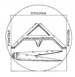
Our recommendations were based on what “works well and looks good”—a modification of the principles of firmitas, utilitas, and venustas by Roman architect Vitruvius.
But there’s a creeping sense that something might not be right. Isolated, a store locator feature makes perfect sense. But how do we know that people use the store locator in the way that it was intended? How does it fit into the larger website? How do people buy power equipment? What are they ultimately trying to do—and how can one make claims of what ought to be based on what is?
Without breaking down into an epistemological crisis, Doejo conducted two brief phone interviews with the business owners of two Ariens dealerships. We mentioned the store locator, but mostly let conversation flow open ended around their experiences with customers. What we found surprised us:
- Customers want a “general snowblower”
- Customers ask “what’s the cheapest one you got?”
- Customers don’t recognize the relevancy of snow frequency, lot size, or lot surface material
- Customers can’t make the correct purchase because they lack the self awareness required to adequately self assess
Although they fell outside of the UX review’s agreed scope, we had ideas about designing a “which snowblower is right for you?” quiz, perhaps ending with the store locator, or even a basic design with buttons labeled by audience category—instead of a grid of products that burdens customers with trying to figure it out by themselves. Given more time, Doejo would have spoken to and watched customers to understand how people buy equipment, and designed an experience around their goal-directed perspectives.
Jakob Nielsen can’t tell you when or where “visibility of system status” is appropriate for your software design, and Don Norman can’t tell you what your affordance should look like or how it should work.
Doejo made the recommendations for the websites’ store locators—but by making two phone calls in 30 minutes, Doejo also made recommendations that could potentially earn Ariens hundreds of thousands of dollars in revenue and make people more satisfied and confident in making the right purchase.
If making design decisions centered around the goals of your users sounds like something interesting to you, get in touch with Doejo about your next project.
Usability comes before beauty, but utility comes before usability.
Let’s see changing the font do that.