
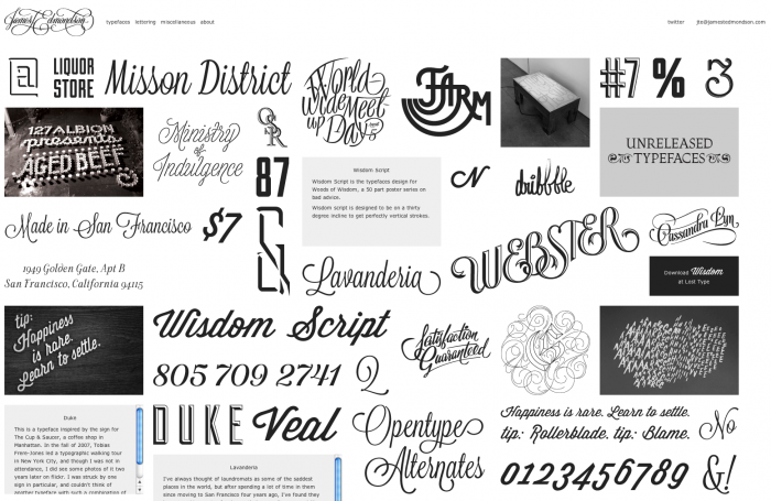
Natural skill combined with a borderline obsessive dedication to type have made James T. Edmondson more than just one to watch in the world of typeface design. His infatuation with type began at the age of 12 when he received a set of calligraphy pens with an instruction book, he says, empowering him to draw perfect letterforms despite his self-proclaimed average handwriting and not so great drawing skills. To this day, Edmondson prefers to approach projects as a lettering artist, not a graphic designer.
Despite his youth and undergraduate status (Edmondson is currently studying at California College of the Arts) his designs are frequently featured on Lost Type, a pay what you want design co-op where designers receive 100 percent of funds.
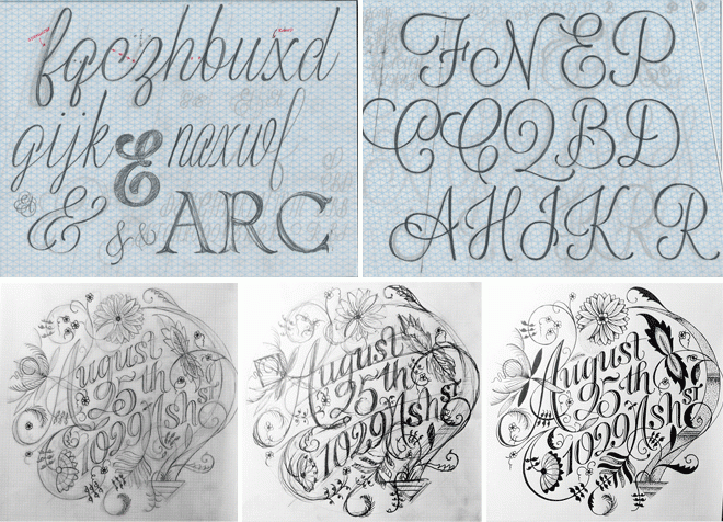
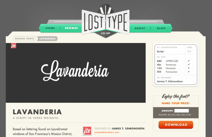
Known for his conscious designs that are brimming with personality, Edmondson’s work is often featured in Doejo projects, including this poster for Chicago Media Social that uses Wisdom Script and Duke, two of Edmondson’s fonts. Proccess sketches for another one of his fonts, Lavanderia, can be seen above.
We chatted with Edmondson via email, asking him about his design process, the role art history plays in type and how social media affects the future of typography trends.
How did you become interested in designing typefaces?
As soon as I realized that it was something that people still did, I wanted to try it. I was 19 or 20 when I created my first alphabet. My earliest efforts were on the site FontStruct, which is an awesome application, but it’s best suited for modular letterforms. Hardcore geometric designs don’t interest me the way humanist forms do, so I quickly gave up on building typefaces, and instead spent a lot of time drawing letters in Illustrator. When I started using FontLab, everything clicked.
Why do you think vintage-inspired typefaces are so popular right now?
I think vintage-inspired everything is really popular right now, so people need typefaces to match. I know I appreciate the beauty of mid-century stuff for its simplicity and because it was a golden age for hand-lettered scripts. Another reason it’s popular is because it is the opposite of the design trend that came before it. Perhaps it’s as simple as that.
What do you think the next big trend in typefaces will be?
What’s going on in Europe seems like such a far cry from what’s popular on Dribbble and the like right now. I hope to see more experimentation, and people getting more impressed with things that are interesting, rather than obvious and traditionally beautiful. Social media discourages this: something daring and weird is less likely to get views or likes than something obvious and well executed.
How would you describe your design process? Are there any specific rules you follow?
I try to sketch on paper as much as I can. I usually ink my sketches by hand if I have the time. I prefer going a bit slow. Each project is different, and I don’t beat myself up for adjusting my process according to the constraints of the job. After a sketch or direction has been chosen, I carefully craft the beziers with extreme patience. I take pride in my curves like a plus-size model.
Where does most of your design process take place? What is your ideal work space?
Right now, all my work is done at home in my room. This is not ideal. I’m from a big family, and I love having a lot of people around. My ideal space would be maybe 30 independent designers or small studios all in a rad warehouse space with music playing, ping pong tables, and visiting designers stopping by to hang out. A mini ramp would be cool. Just writing that, and looking back at my desk makes me think, “What are you doing dude?!” One day it will come true, and it will be a blast.
Art history plays a huge role in many designers’ point of view and style. Are there design time periods such as Bauhaus, Renaissance, or Constructivism that have effected your point of view or aesthetic?
When I think about type design, I think of design principles that aren’t tied to time. Figure/ground relationships, rhythm, and consistency are what my brain revolves around when I’m designing type—calligraphers had that stuff nailed a long time ago. One thing that is awesome about this craft is that I can focus on any sort of style I am interested in at that moment. Most often it’s 20th century, but I’m interested in going back further.
Also, quality is a much larger consideration than style in my mind. With every release, I try to drastically improve the overall product from the last one I put out. I am blown away by type designers like Jackson Cavanaugh. His first release was Alright Sans, and it was this huge perfect thing. And it sold well.
How did you get connected to Lost Type?
I stumbled on Lost Type after I designed my second or third typeface, Wisdom Script. I shot Riley Cran an email and he got back right away saying he was interested in Wisdom Script and Duke. I remember being bummed that he didn’t want my typeface Edmondserif, but now looking back on that font, it’s so obviously a piece of shit. Riley made a good call.
What drew you to working with Lost Type?
At that point I had finished three fonts, and I wasn’t sure what to do with them—whether or not I wanted to put them up on MyFonts, or just let people download them for free. Lost Type seemed like a perfect balance. It’s proven to be a great decision. Having my fonts out there got my work a ton of exposure, and in the last year I’ve met so many of design heroes, and made lots of new friends.
What’s it like to see typefaces you designed being used in a variety of circumstances?
It’s fun! The weird thing is how excited my parents and friends get. I didn’t expect anyone else to care (or even to be able to spot which fonts were mine). My mom was excited when Wisdom was BarackObama.com, but I was thinking, “Who cares? RON PAUL 2012!”
Are you concerned about your fonts becoming overused because they are available on the Internet for free?
Should I be?! I’m a little bit bummed that Wisdom has become so popular because I now see how weak the design is. That said, there is no shame in a popular design if it’s well made.
What are your plans for the future?
One goal is to get accepted into the Type & Media program at The Royal Academy of the Arts in The Hague. Another is to write a hit song. I am also interested in other areas of design like furniture and interior design. I would love to work for trade more often. I really want to do some work for Vans—designing a skate deck or doing lettering for a skate company would be just great. I’m actually terrible at skateboarding, but it has by far the most visually appealing culture and design. I think snowboarding is the worst. It’s right down there with ’90s NBA logos and energy drink cans. Lastly, I would love to teach typography some day. That’s major incentive for graduating college.