
With so many talented designers working at Doejo, we tend to geek out on great web design and get a little critical of not-so-great design. So, this week we thought we’d put our critical eyes on five local news sites, blogs and broadcast stations keeping our best design practices in mind, much of which was implemented on our WordPress.com VIP work with Local TV’s news sites this summer.
We asked information architect Justin, UX designer Jeff, web designer Marko and WordPress.com VIP expert Rinat to critique the design and usability of five news site’s homepages (steering clear of judging company branding objectives and actual content).
Check out their criticisms and praises below, you may be surprised at some of the easy fixes many of these sites could make. And of course, we’d be happy to make it for them.
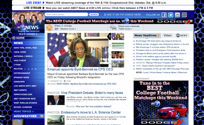
ABC Local 7 – The number one viewed broadcast station in Chicago
Jeff: The center column looks a little dated. There are too many options in the navigation—you want to guide people where they want to go, not overwhelm them. The weather’s on there twice and it has contradictory temps, it’s redundant. Also, any text smaller than 14 points is too difficult to read online. The page is too long and I’m sure you’ll find that not too many users are scrolling to the end of the page.
Justin: There’s no hierarchy. The headlines need to be bigger. Everything’s the same size but the ads; your eyes go to the ads first because it’s the biggest thing you see, which really shouldn’t trump the content. It would be better with a hub and spoke model. They should show fewer categories then provide subcategories within them. There’s too much of their navigation “below the fold.”
Marko: There’s no hierarchy for the feature story or weight to it. What is the feature story? If this was in print you would know right away, but not online? The news headlines are too tiny; the ads look more like news stories than the news stories. I don’t know where to put my eyes first and I really just want to leave this site. It’s too claustrophobic.
Rinat: I don’t like the navigation; I’m lost on the page. You have to scroll down far to see all of the subcategories. They need to get rid of the subcategories and focus on a few categories and give them top-level navigation. The featured story carousel scroll is also slow-responsive.

TimeOut Chicago – a weekly magazine about Chicago culture and events
Jeff: There’s too much going on in the carousel and you can’t click the image to get to the stories. The headlines are too tiny and it’s hard to find the latest content because it’s broken up into miscellaneous categories. The ads are also clearly shoehorned in, it’s all too crowded. The sidebar is also longer than the content area and the search bar is too hard to find in between the ads.
Justin: At first glance it looks like your parent’s browser where they have too many tool bars on top because they don’t know how to get rid of them. They have font size issues, there’s a lot of wasted space that could be used to make the fonts bigger. The ads could be better distributed too, it looks like everyone wanted to be “above the fold.” Towards the bottom of the page it looks like their grid falls apart and the best navigation is the footer all the way at the bottom. I also can’t find their social media accounts easily.
Marko: There’s too many ads, repetitive ads. They have ads that that look like the navigation, which is confusing, and they take up too much real estate.
Rinat: The font sizes are too small. And the scroll carousal is tiny. It needs to be simplified, especially the categories for effective content consumption. They should just have feature stories not categorized feature stories. It’s claustrophobic below in the subcategories. The margins are too tight; a three-column layout would look better.
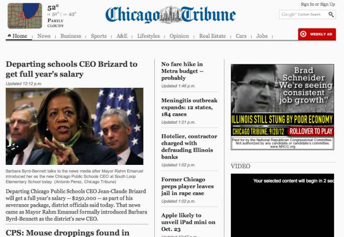
Chicago Tribune – the largest daily newspaper in the Midwest
Jeff: It’s a bit long in the scrolling and I’m not sure right away what the center column is, is it breaking news? I do really like the radar image at the top left for the weather, that’s smart.
Justin: It’s a good font size and good use of a grid.
Marko: I can tell what the feature story is, the ads look like ads, and they are controlling what you see. It’s a much better layout than the others. You can tell what is the navigation and there are not too many stories competitively.
Rinat: They have their categories and latest stories clearly placed. It’s a good quick scan and easy to consume content.

Chicagoist – one of the most popular culture blogs in Chicago
Jeff: There’s a lot going on but there’s hierarchy at least. I like the grid layouts myself. They also have layout switches, which is interesting, they have a “blog” view for stories and a “popular” view for what’s trending. And it is more of a blog site, which shows—there’s no immediate “breaking news” urgency here. The only real problem is there are no stand alone category sections. There’s “Arts and Culture” and “Entertainment” stories but no page for them to exist alone.
Justin: The search placement is good. There’s also a decent amount of space between ads. It could use a footer though, all the “staff” and “contact” info is oddly in the left column.
Marko: It looks like an article is sponsored by American Express in the middle [below one of the ads]. There can be better use of visual separations between categories. The subcategories below aren’t separated enough, it needs to be more deliberate. I have mixed feelings about this layout but over all it’s not bad.
Rinat: It’s not bad, the positioning of the ads are awkward, it looks like an error in alignment.
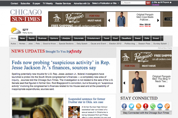
Chicago Sun-Times – Local daily publication, oldest paper in city
Jeff: The navigation is odd—the distance between categories to subcategories is far. They should stand out from the side bars more. But other than that, not a bad design.
Justin: It’s chunked really well. Slabs of “News” and “Entertainment” subcategories are more deliberate than most news sites, which is good. The type could be bigger, the body content too. The hierarchy for subcategories could be improved; they’re all the same size. They should have a 50/30/20 ratio.
Marko: It’s OK, it’s second to the Tribune in design. I can see the stories, I know what the feature story is and the subcategories are readable.
Rinat: The navigation is easy to use and the subcategories have subcategories like in “Sports” there’s a “Bears,” “Sox,” and “Hawks” section.