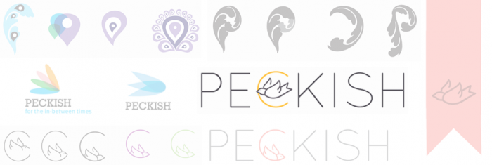
Peckish
The founder of Peckish wanted a logo that positioned the subscription snack service as a luxury product, thoughtfully packaged and delivered. Our designers suggested that the mascot and iconography be represented as a bird, to play off the name “peck” and since many of the snacks are fruits and nuts. While agreeing on a sparrow bird in the final ideation, our designers incorporated it holding a packaging ribbon to make the ‘C’ in Peckish. Notice a peacock was used as inspiration initially.
Font: Quicksand Book
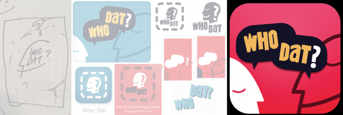
Who Dat
To create the logo and overall art direction for social guessing game Who Dat, our designers looked towards classic board game history, taking aspects from games like Monopoly, Battleship and Guess Who, as well as modern bubbly apps with bright, colorful buttons. The idea of the logo was to capture the Who Dat’s social-gaming aspect with talking heads and speech bubbles. This product is currently in production.
Font: Kentucky Fried
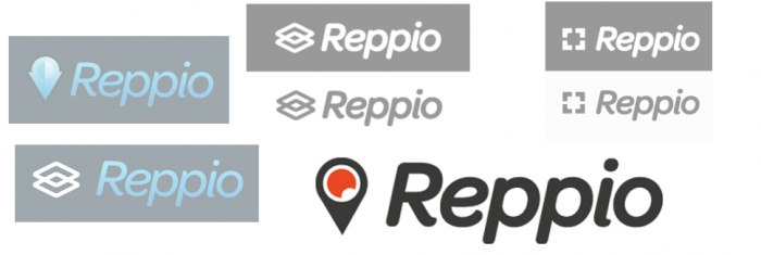
Reppio
This online sales platform, which positions itself as a more reliable and profile-driven Craigslist, needed a more professional logo to show off its location-based features. Reppio sought a logo from Doejo that incorporated its “Rep Score” icon, displaying user’s sales ratings. And since users and products sold can be searched by location, the new Reppio logo also evokes a pin in a map. This site’s redesign is currently in production.
Font: Omnes Semibold
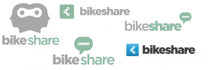
Bike Share
Cycling community resource Bike & Park wanted Doejo to design a simple logo for its new online forum, Bike Share. Our designers evoked a feeling of community and conversation while tying in bike gears. A blue tone aligns with the company’s Bike & Park gear and pedal logo, which we also designed a year prior. This site is currently in production.
Font: Gotham Black