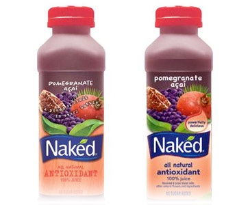
The long line of half-assed PepsiCo redesigns just got longer. In a move that’s equal parts baffling and amusing, Naked Juice labels now sports America’s favorite font: Comic Sans.
What’s most upsetting is this is an otherwise successful redesign. The tightly-tracked Gotham Black is a more natural fit than the typewriter font of the former label. The over-styled background and logo are now confidently flat. And for what it’s worth, Comic Sans is more legible than the previous typeface. But without any sense of personality or brand.
Maybe PepsiCo is playing a huge joke on designers. What do you think?
