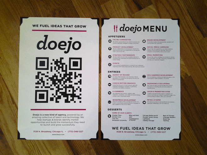
The Doejo office is surrounded by restaurants. They’re everywhere. So, why not create a menu of what our business has to offer just like our neighbors?
We thought it’d be fun to showcase all the awesome things we can do here in a different way (than would be expected). Our menu provides a list of the services we offer and actually explains all the different things we can achieve.
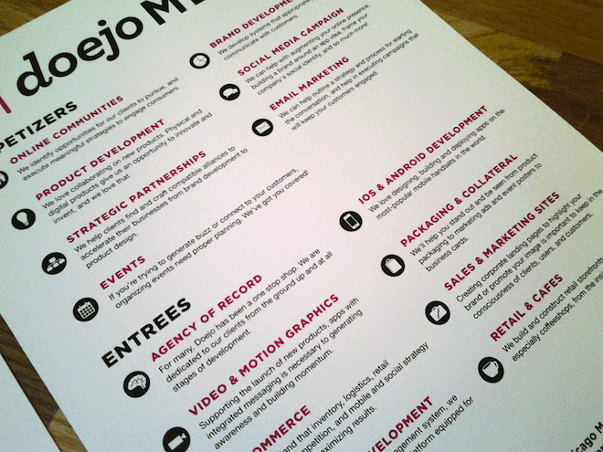
Icons are huge in design. We developed them so that they had a sense of a humor, but purpose as well. They are fun, clean, attractive to the eye and simply intriguing enough to make the viewer want to learn more about what they mean. Plus, they’re a great visual cue for someone to remember.
We also wanted to adhere to our brand manual. It’s important when designing for a brand to understand the rules in order to keep it consistent. Otherwise, everyone involved gets confused and that’s they last thing we want for clients. The magenta will live on!
By designing it as a menu, we believe it will captivate everyone passing by. We don’t look like a restaurant but we live among them so menus on the door is place. What a shock it’ll be when our number one appetizer is building “online communities.”
We want to shake things up and make people think and developing this menu was the best way to do it and inform the community to what we really do. Community is huge in this neighborhood and we like being a part of it. And who doesn’t like a good laugh too?
(Better images to come soon!)