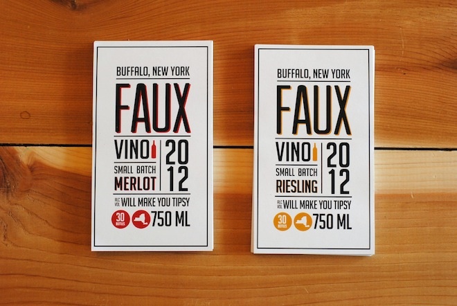
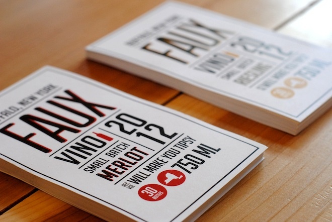
Faux Vino is a specialty wine that makes only small batches. Just thirty bottles of merlot and riesling are produced, making their wine deserving of a special and unique design.
My design thought process:
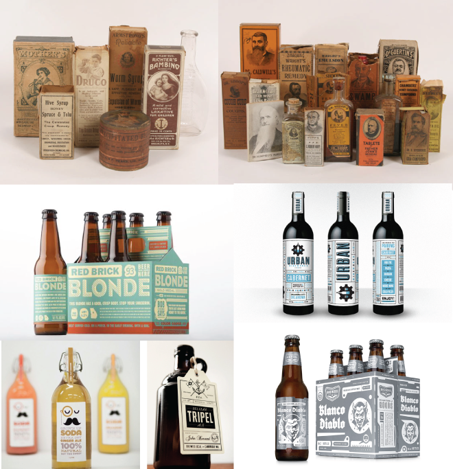
When creating the labels I wanted to give them the feel of a specialty mark. I found inspiration in old apothecary packaging, which is very popular in design today, and gave it a modern facelift.
I wanted to keep the whole design light hearted. Special icons were created for the customer to learn about the product and have fun with the packaging. It gets them involved which is fun for everyone. Also, using a sarcastic sense of humor with the information is another popular element used in design today to get the customer to participate with the product and get to know the company more. Stacked large type is huge right now and for good reason. It’s in your face and easy to read. There is no beating around the bush and trying to over do the design. I am biased because I cannot get enough of clean design but sometimes keeping it simple is really the best way to go.
I didn’t want the wine labels to be traditional and produce the same look most wine companies do. I went for a design that is more reminiscent of microbrewery packing design. These companies are using a completely different style that is becoming more and more popular. Judging a book by its cover is coming in handy more often than not lately and using this light hearted, fun aesthetic is what is winning people over.
Some of my inspiration: