![]() Since August, Doejo has been teaming up with web design lifestyle blog Inspired Mag to interview digital designers, illustrators and artists twice a month for column called “Designer’s Block.”
Since August, Doejo has been teaming up with web design lifestyle blog Inspired Mag to interview digital designers, illustrators and artists twice a month for column called “Designer’s Block.”
We’ve talked with Russ Maschmeyer, Stephen Di Donato, Trent Walton, Jon Contino, Aaron Scamihorn, Matt Braun and Brent Couchman so far about what inspires their work, what artistic media they’ve tried (or hope to someday) and a bit about their noteworthy and captivating work. Here are some highlights of the year in snippets of the interviews:
Designer’s block: A Q&A with Stephen Di Donato
Illustrator and graphic designer, Stephen Di Donato, like many designers with an agency past, has an eclectic portfolio. Whether he’s constructing an app for designer/developer think-tank hub Forrst or orchestrating the corporate identity for New York based bike-rental company Velocity, Di Donato’s aptitude for accessible user experience keeps his designs down to Earth.
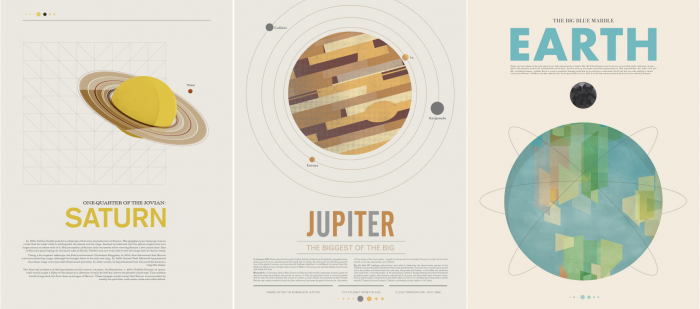
His new Kickstarter project, on the other hand, is a bit out of this world. Beyond Earth: A Poster Series, is the Montreal resident’s attempt to produce an astrological homage to the United States’ passion for space exploration, consisting of eight posters profiling planets in the Solar System. The nostalgic 1960’s aesthetic caught our eye as the fundraising project launched last month.
Doejo: First off, let’s talk about your Kickstarter, you talk a bit on the site about how why you started this project, but how would you describe the design aesthetic for NASA and the 1960’s look at space exploration. What fascinates you to it?
Di Donato: I tried to imagine the feeling of something new and something exciting that was taking place at that time. Today we look at the space program from the perspective of multiple moon landings and shuttles and space stations, but at the time this was all just a vision for the population. So I tried to put myself in that mood of anticipating great things to come and the design came from an idealized vision of space. The 1960′s were more simplistic when it comes to design and advertising, so I tried to capture both the design and vision of the time.
The fascination comes from putting myself in the shoes of a different era, but at the same time using modern technology. I’ve always been a fan of the juxtaposition of the new and old.
Read More of the interview here.
Designer’s block: A Q&A with Jon Contino
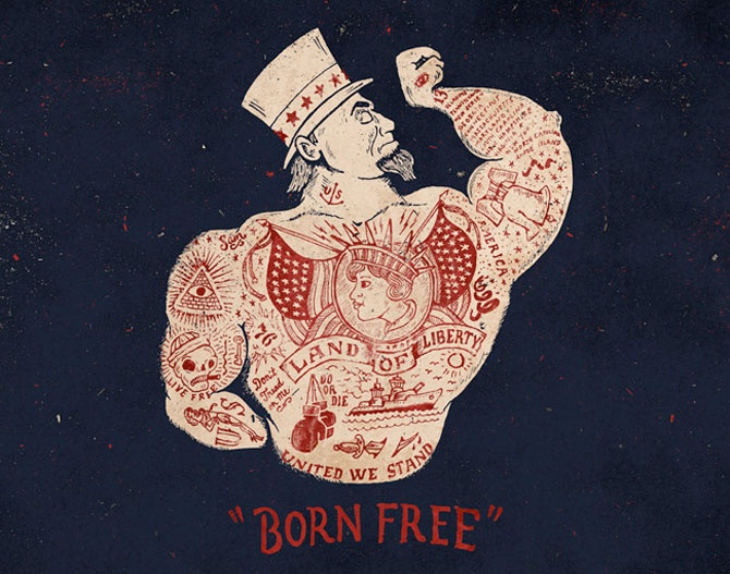
Brooklyn-based designer Jon Contino’s work can be found among various brands. But much of the freelancer’s creative energy is funneled into typography-centric menswear label, CXXVI Clothing Company, where he is the co-founder and creative director. He describes himself as an Alphastructaesthetitologist (say that five times fast).
While specializing in hand-lettering and illustrations, much of Contino’s designs pay tribute to classic Americana, from nautical themes to reworked historical iconography. Other branding identities where you’ll recognize Contino’s handiwork: Brooklyn-based Silk Road Cycles, logo design and lettering for FX Network comedy series “Louis,” and in illustrations for American military supplier Alpha Industries.
Doejo: Where did your Americana inspiration stem from?
Contino: I’ve always been a sucker for Americana. I really can’t remember a time when anything USA-based wasn’t a major part of my life. My favorite holiday is the 4th of July for crying out loud! The nautical stuff has always been pretty natural as well. I grew up just outside of Manhattan on Long Island right on the Atlantic Ocean. I spent a good portion of my life surrounded by water or nautical stuff in general, whether it was at the beach, on a boat, or in a cheesy neighborhood restaurant that had oars and anchors hanging on the wall that was run by an old sea captain or fisherman. It’s one of those things that has been drilled into my brain and has some kind of subconscious, yet major, influence on my style. The detailed historical work I’ve been doing lately is definitely the newest of my major influences though. In the past few years, I’ve really developed an appreciation for history, and the more I learn, the more I want to revisit it in some way. Going back to a time when the production of all things was so different is so fascinating to me. I try to incorporate that sense of magic into my work whenever I can.
Read more of the interview here.
Designer’s block: A Q&A with Matt Braun
To say that Matt Braun is dedicated to letterpress in design is an understatement. Clearly. When you look at his portfolio you’ll see loopy ampersands, whimsical descenders, ’50s-diner-inspired iconography and an attention to detail to keep your eyes wondering, mesmerized.
The senior designer at Pittsburgh-based design and development agency Bearded has done design work for Campfire’s chat app Briquette, biodiversity promoter The Sprout Fund Spring Program and bestselling confessional book series Post Secret’s “Confessions on Life, Death & God.”
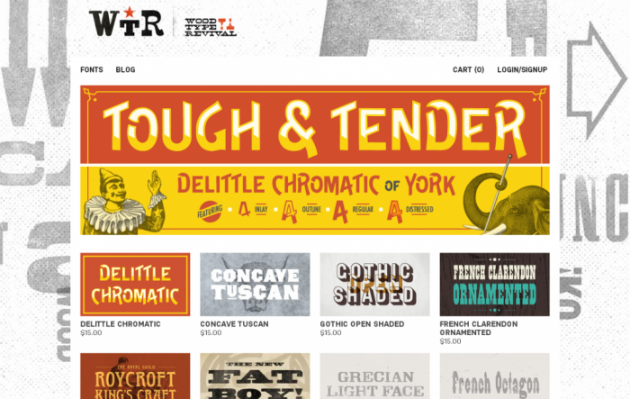
Most notably, Braun co-founded the Wood Type Revival, an historic wood type face rescue-and-recovery project and successful Kickstarter we profiled on Inspired Mag in the past.
Doejo: What were/are some of the challenges of bringing the Wood Type Revival project into fruition?
Braun: One of our first concerns was being able to find the type that we wanted. Once we got a hold of it, we then had to do some experimenting with the process of recreating these faces for digital use. Our goal was to try and stay as true to the original contours and forms as we could. Once we got the creation process down then there’s the whole other world of font software and trouble shooting.
Another issue was locating any missing letters in incomplete fonts that we bought, which is how a lot of type is now. For the most part all the faces that we purchased were complete but there were some we had to do research and find a specimen that would fit the font.
Read more of the interview here.