It’s been an exciting week for one of our latest client site launches, The Snackpot. Here’s a look at how our team built this pie- (Twinkie?) in-the-sky idea.
Local music publicist, Jacob Daneman and writer, Keith Ecker came to Doejo with a pop culture review site idea that can be described as a mix of music site Pitchfork, ESPN’s Grantland and The Onion’s A.V. Club—except, their dream was to celebrate all things snacks. And The Snackpot, which launched May 2012, does just that, from sweet and salty to fried and frozen. And then some.
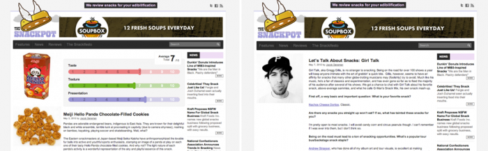
Daneman and Ecker teamed up with our designers and developers to create the witty review site, which they hope will raise snacks and snacking to a higher echelon of pop culture. While building hype for snack foods and dishing snack industry news, The Snackpot was designed primarily to serve up comprehensive bite-sized reviews, as well as long-form essays.
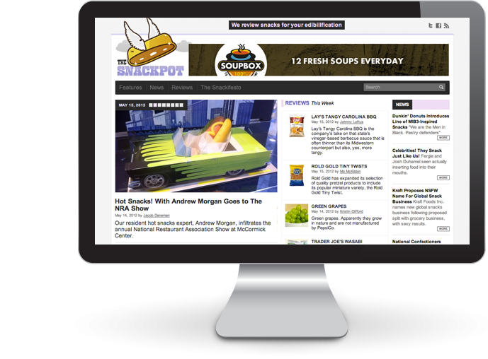
To ensure that Snackpot staffers could post anywhere from 300 word reviews to 1000 word features seamlessly, our developers equipped the site with a WordPress publishing platform. And for the more visual consumers of the site, each review page comes outfitted with a custom rating scale, grading each snack by taste, texture and presentation.
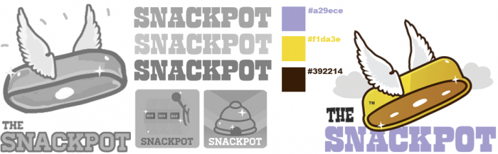
To categorize specific cravings, we built a “Snacktionary” at the bottom of the homepage to navigate the various tags (sour, sticky, chewy, etc.) compatible with the site’s “Snackifesto” verbiage. And to channel this snack authority’s humor, playfulness and wit, our designers used sugary colors throughout the design and a flying Twinkie as The Snackpot logo.
Check out some of the logo iterations below.