It can be remarkably comforting to get away from the glow of your computer screen, to go back to a time when word processing was more analog. Way more analog.
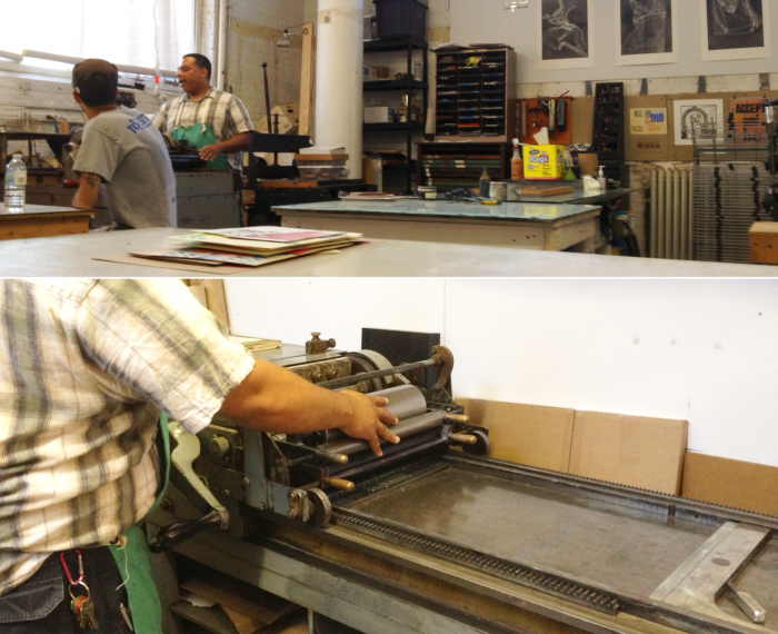
Tuesday night was my first “First Time Letterpress” class Lillstreet Art Center in Ravenswood, Chicago. Along with seven other students we met with the master printer who built the print shop at Lillstreet, Tom Lucas in his studio.
The wood type and printing presses at Lillstreet, like most still in existence around the world today, was second hand with upwards of 100 years of previous use. Everything was an antique. There was a history and a story to each letter, each printer and all the curious-looking tools being used in that studio that was a bit romantic.
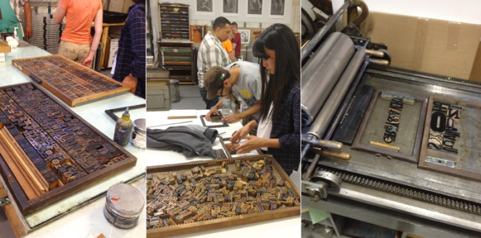
We spent the majority of class learning how to set wood type, measuring with a pica ruler and aligning mismatched wood blocks right to left into the brass chases. He explained the mechanical process of filling in blank spaces with appropriately sized spacers or “furniture and reglets” and tightening it in with a quoin and quoin key.
There was a science to understanding ink chemistry and preparing it perfectly on the ink slab. Everything was all so meticulous—unpredictable yet still methodical.
Unlike digital word processing you have to measure physical space, there’s no hitting a space bar on your iPad, Tom said. “You have to put in something physical to make that space. Its analog at it’s most basic.”
I don’t want to use the word archaic but that’s what it is, he said, and that’s what a lot of these artisan based print mediums were about during he colonial and Victorian areas.
When it came down to the art of letterpress, we talked about how to make type look like it was in motion to convey speed, for example, or how to aesthetically represent a message using a particular font, ink color or transparency to compliment the copy. It was all a lot to take in but still exciting, especially to see the trays of distinctive fonts and characters we can use.